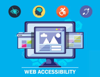
Most web developers overlook the fact that not everybody traditionally uses the web. Most accessibility issues that make websites impossible to use can be fixed or, better still, avoided easily. When you incorporate website accessibility features on your page, you should look for some common website accessibility mistakes that may invalidate your efforts. Also, fixing these errors will mean that you will be avoiding issues that most websites face. Additionally, if you rectify these mistakes; remember, accessibility is more about functionality and not form. To achieve this goal, go through some of these common mistakes that website developers make. This can improve the functionality of your website.
Low Contrast on Website Texts
Low contrast is the most common website accessibility issue affecting pages on the web. On a standard text, the expected level of contrast is 4.5:1. This makes it visible to everyone, including those with low visions and those who are color blind. Contrast issues can easily be fixed. They can either be fixed on the specific place the error has occurred; or the whole theme can be changed on the site. You can rectify these mistakes by using accessibility tools like the color contrast checker to determine whether the contrast is on the correct level between your text and the web page’s background. Note that the theme may apply different colors for the;
- Headings
- Captions
- Lists
- Buttons
Missing Image Text Alternatives
The lowest hanging fruit that you can start with is to resolve the images that are missing a missing alternative. If your image is directly related to the content, you cannot miss out on the alt text describing the contents of the picture. If your image is decorative, meaning it does not entirely relate to the content, you can only include the alt tag and not the alt description.
Incorrect HTML Heading Structure 
Your work needs to be predictable, especially for those using screen readers. Therefore incorrect HTML heading structures may make your content look disorganized. Additionally, it may give those using assistive technologies a hard time when navigating the site. For example, if you use bold text for titles instead of using the proper head ranking levels such. Your heading structure should be denoted as h1, and the subheadings should be in the proceeding order.
Placing Links without Text Alternatives
Have you added descriptive text in the source code of your website link? And if you are using linked images, does the alternative text describe where the link goes? URLs are not always descriptive; thus, the reader may not know where they are being directed to by the links. Hence the need to add anchor texts to give a brief description of what the reader should expect once they click on the link.
Non-Accessible Forms
If you have included contact forms or any other type of input field on your web pages, then you need to ensure that everyone can use them by labeling them correctly. If you make an error of not including the <label> element in your code for each field, then people using screen readers and text input will be left out. Additionally, try to have labels directly above their respective fields instead of placing them inside the input slot.
Uneven Text Spacing
The uneven spacing usually occurs when the text on your page is both left and right justified. Texts that are not arranged uniformly may make reading a challenge to people with cognitive disabilities. For instance, some words could be cramped up together that the reader may not discern where the word ends and begins. Also, if there is no space between the lines of the text, it may be hard to determine where a new paragraph begins or ends. Remember, not everybody can distinguish such basic things, especially if they have learning difficulties, such as people with dyslexia.
Buttons are Missing Alt Text.
If you have added buttons on your page to make navigation of the page more straightforward, then you also need to include alt text. Without the alt text, it will be impossible for a person using a screen reader to tell what the button’s function is and will not be able to access that part of the page. For example, if you have a search input field, then you can add beside it or below it a descriptive alt text ‘submit search’ or anything in line with the search bar. This lets the user know that by clicking on the submit search, they activate the search field.
Wrapping Up
You can always do an audit of your page to check whether some of these errors exist. Most of them can be rectified even after the page and content have been entirely created. You can quickly assess your website by using an appropriate checker that will help you pick out most of these errors and make you achieve an accessibility-compliant website.


